I buried the AI lede
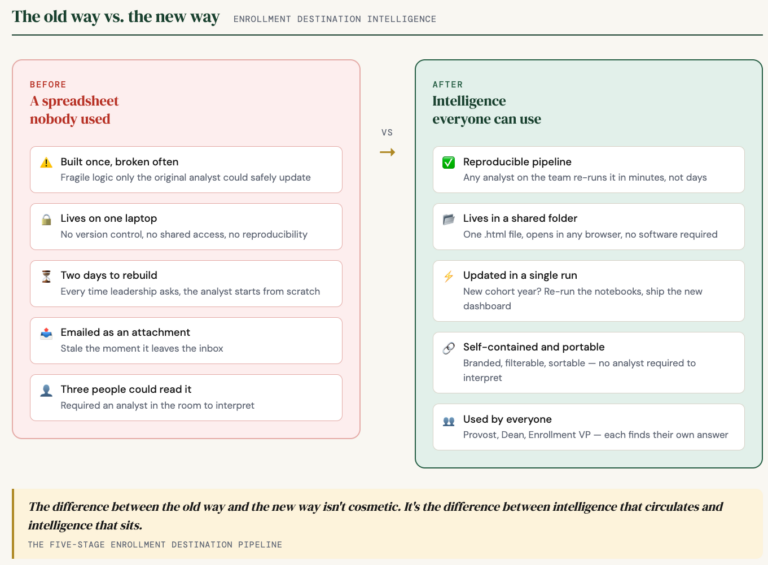
When new data enters the pipeline, a full rerun used to mean hours. Pull everything, re-join everything, wait. That was the cost of keeping enrollment data current.
The architecture I described last week does not work that way. New data drops into the stage where it belongs and everything downstream picks up from there. A new admissions extract does not require re-querying the Clearinghouse. A mid-cycle enrollment update does not require re-enriching the destination school list. One stage updates. The rest follow. That is the difference between answering a question on Tuesday and answering it next week if someone has time.
What I left out is that this did not happen by accident. AI turned a single notebook into a multi-stage chain. Each stage is discrete, owns its inputs and outputs, and can receive new data independently. The structure exists because AI designed it.
The dashboard is the other thing I undersold.
The final notebook, the one that builds the HTML output, did not exist before this project. AI wrote it from scratch against a design brief. It reads a JSON file from the previous stage and produces a single self-contained HTML file. No software. No server. Opens in any browser. A provost can carry it into a board meeting on a laptop and answer questions on the spot.
Here is what that file actually does. Twenty-six sortable columns. Year-by-year enrollment from Fall 2018 through Fall 2025, each its own column. The dataset grows additively: as each new cycle closes, the new cohort appends to the file and the longitudinal picture gets richer without being rebuilt.
The feature that surprises people is the profile split. Every destination school carries two student profiles: one averaged across all eight years, one calculated from the three most recent cohorts only. You can sort by either. That means you can see not just where your admits went, but whether the kind of student choosing a competitor is changing. A school that has pulled five students a year for eight years looks different if those students used to have a 3.2 GPA and now they have a 3.7. That is a drift signal. A spreadsheet cannot surface it because a spreadsheet cannot hold the comparison in the same view.
Each school also carries its IPEDS data inline: tuition, net price, retention rate, graduation rate, total enrollment. A competitor stops being a name in a column. It becomes a profile.
When an enrollment VP looks at the output and asks for a different sort, a new filter, a different grouping, the change takes minutes. Because AI generated the interface from a data structure and a design brief, it can regenerate from a revised brief. Most IR shops cannot do this. They produce a report, it ships, and the next revision is a project.
That post was about what the pipeline does. This one is about what made it possible to build, and what makes it possible to maintain. Those are different things, and I should have led with both.