
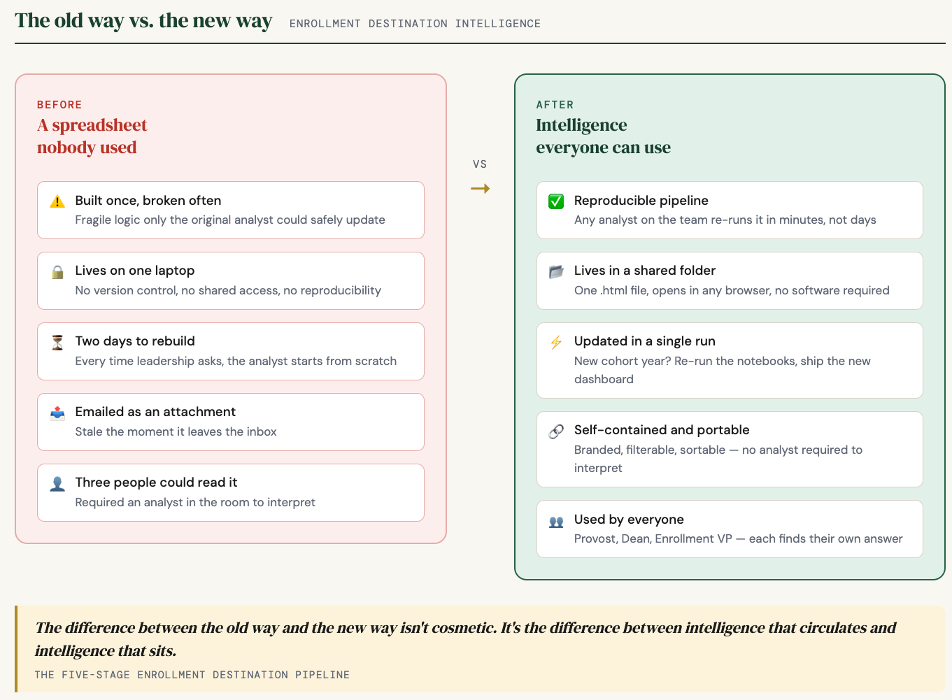
From a spreadsheet nobody used to intelligence everyone can act on
Every admissions cycle, colleges make thousands of offers. A fraction of those students say yes and show up in September. The rest go somewhere else. Enrollment managers have always suspected they knew where. Suspicion and data are different things.
For most IR offices, the standard answer to “where did our admits go?” was a spreadsheet. If you were lucky, someone had built one. If you were unlucky, it was three years old, lived on one analyst’s laptop, took two days to rebuild every time leadership asked, and was held together by enough hidden logic that only the person who built it could touch it. By the time it reached the dean who asked for it, half the room had moved on.
That is not an intelligence product. That is a liability dressed up as a report.
What follows is a five-stage architecture that fixes this. It runs on Python notebooks, it is reproducible, and it ends with something a provost can open at 7:45am without calling anyone.
The difference between the old way and the new way is not cosmetic. It is the difference between intelligence that circulates and intelligence that sits.
01. Extract and enrich
Your student information system holds every application ever submitted. Most offices pull what they need when they need it, run some queries, and export to Excel. The problem is you rebuild the same foundation every time someone asks a question. A better approach uses caching – the first run takes time, every run after that takes minutes. You pull once, enrich each record with the fields that matter for analysis, and write the result to a stable file that everything downstream reads from.
02. Find the gap
Cross-reference your admits against your official enrollment census – the headcount your institution freezes a few weeks into each semester. What is left after the join is your melt population: students who were admitted, may have deposited, and never showed up. Segment by student type, term, and academic profile. Now you know not just how many did not come, but which kinds of students did not come. Aid strategy and recruiting territory decisions live in that distinction.
03. Ask where they went
This is the step most offices skip, and it is the one that changes everything. The National Student Clearinghouse tracks enrollment at nearly every accredited institution in the country. You submit your melt population; they return records showing where those students actually enrolled. Most people outside higher ed do not know this step exists. It shifts the question from “how many did not come?” to “where did they go?” – and you can answer it not just for this year but for every cohort going back as far as your data allows.
04. Add context
Once you know where your admits landed, attach publicly available federal data to each destination school – tuition, sector, selectivity, institutional type. A school name stops being just a name. It starts telling enrollment managers something real about the competitive set they are operating in.
05. Ship the intelligence
This is where most pipelines stop short – and stopping short is exactly why the old spreadsheet stayed a spreadsheet nobody used. You have to build a presentation layer that puts the answer in front of the people who need to act on it, without an analyst in the room to translate.
That means an interactive dashboard. Filterable by year, student type, state. Sortable by any column. Branded to the institution. One HTML file that opens in any browser. A provost can carry it into a board meeting and answer their own questions.
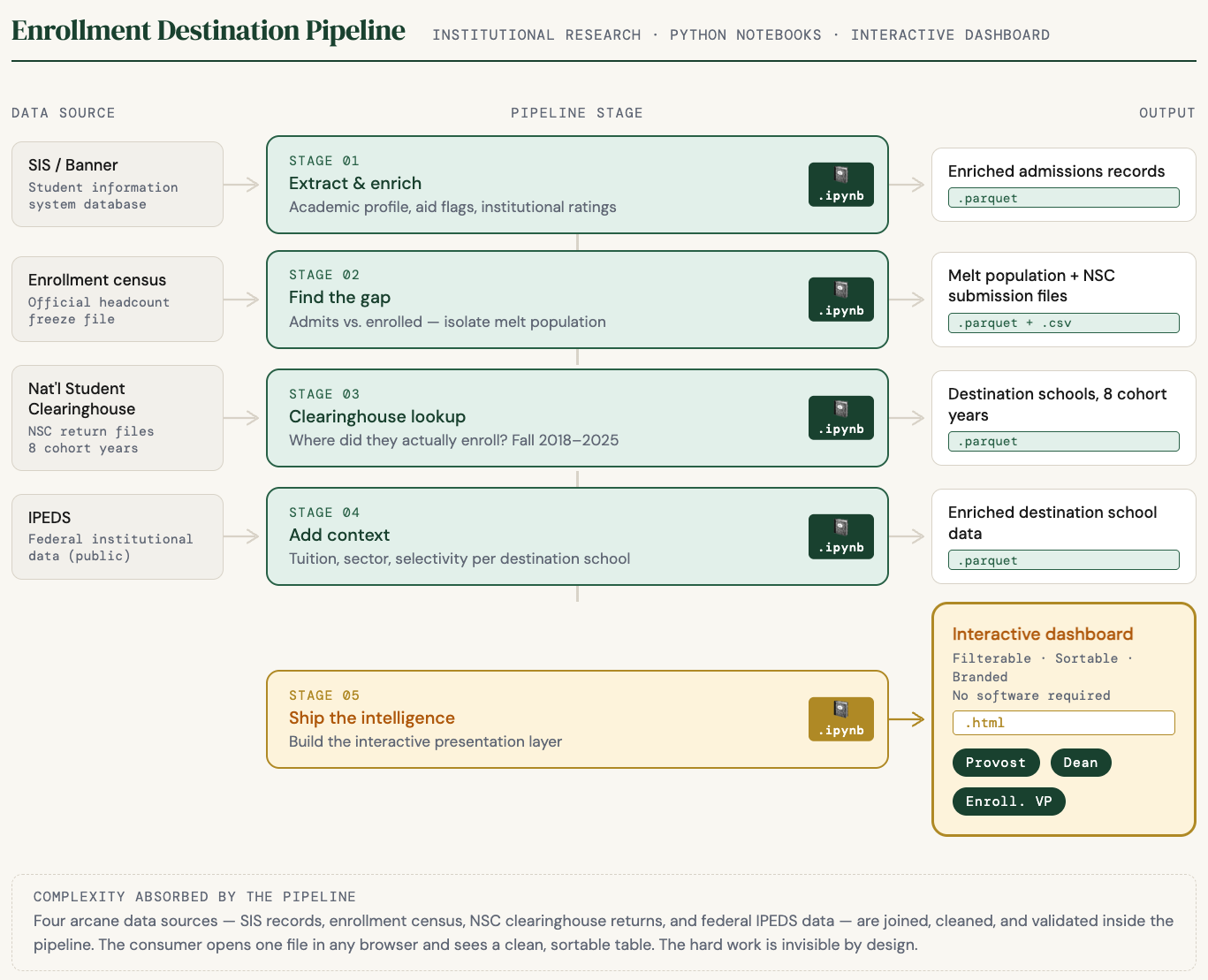
Four data sources get joined correctly behind the scenes. The person opening the dashboard never has to know that. What they see is a clean table of destination schools with tuition data and sector context built in. The pipeline absorbs the complexity so the consumer never sees it.
The students who said no went somewhere. The IR offices that know exactly where – and can show anyone in thirty seconds – are doing something most of their peers have not figured out yet.