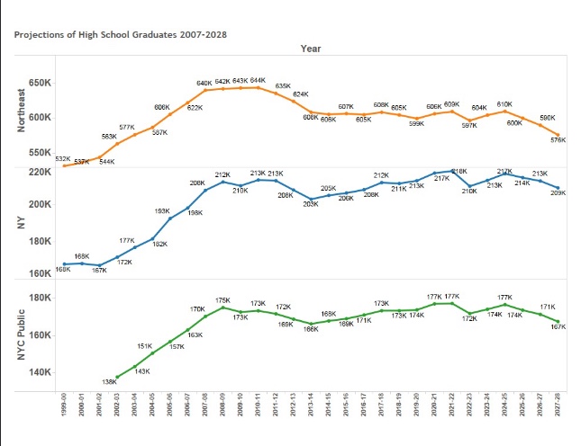
Projection of High School Graduates 1999-2028 – Tableau
Data from the Department of Education. Visualization is done in Tableau. This is a PDF of the output. As mentioned in many outlets already, the Northeast is in for a rough few years.
“Don’t Blame Me” was written by Geoffrey Canada in 2007. He recited it at the 70th National Association for College Admissions Counseling (NACAC) Conference in Indianapolis on September 18, 2014 The girl’s mother said, “Don’t blame me. Her father left when she was three. I know she don’t know her ABCs, her 1,2,3s, But I…
An excellent guide by Derek Halpern from Social Triggers Like this? Listen to this interview with Dan Ariely from Social Triggers.
This educational infographic provided by SchoolTutoring.com.
Infographic authored by Enterasys Networks. To view the original post, see the original Trends in adoption of MOOC Infographic
The first time I watched a large language model generate research output in forty seconds, I was not impressed by the quality. I was impressed by the volume, and by how quickly it could pivot when I changed the question. The results were plausible, competently organized, and largely superficial. What changed things was connecting to…