
Projection of High School Graduates 1999-2028 – Tableau
Data from the Department of Education. Visualization is done in Tableau. This is a PDF of the output. As mentioned in many outlets already, the Northeast is in for a rough few years.
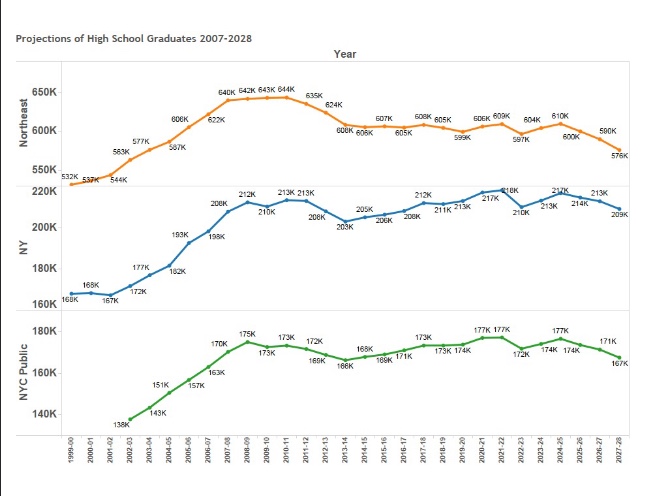
Data from the Department of Education. Visualization is done in Tableau. This is a PDF of the output. As mentioned in many outlets already, the Northeast is in for a rough few years.

Truly honored to have been awarded this distinction. Proud to be among my fellow #NortheasternUniversity graduates. See you on Nov 12th! #Scholars #ChangeAgents #Fall2018Cohort
This is a particularly hairy example of comparative program performance that needed to take into account: (a) program consolidations, (b) shifting departmental oversight, (b) school name changes, (c) sliding test score ranges, (d) and a host of other data idiosyncrasies. This code takes a days-long manual cleaning process and reduces it to about 5 minutes….
This is my project starter file.
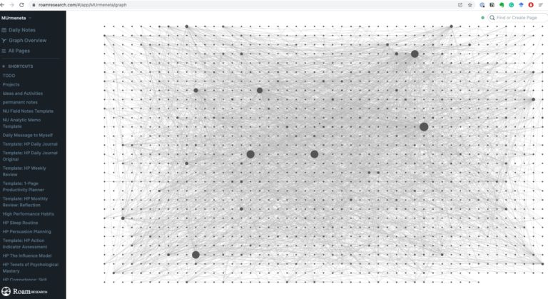
I started using #RoamResearch on August 2, 2020 Here is my #RoamGraph as of September 2021. It’s a networked note-taking tool that I’ve used to create a personalized knowledge web. Some of the things I’ve funneled into it are: (a) academic research, (b) book summaries, (c) meeting minutes, (d) webinar notes, (e) journal entries, (f) website clippings, (g) instructions,…
This is my first attempt at uploading some of my Python code. If this works out, I’ll be posting more!
After my dissertation, I updated my Mac to Big Sur. I wasn’t going to mess with anything until it was done. I’ve heard too many horror stories. When I finally did, I was prompted to update the shell from bash to zsh which cut off my access to Jupyter Notebook and all of my Python…